A hand drawn design of my school magazine contents page.
Tuesday, 5 October 2010
Planning for Contents Page
REGULAR CONTENT
FEATURE ARTICLES
IMAGES
- COMPETITION win your class a trip to London
- PROM PLANNING where are you at?
- TERM DATES perfect planning
FEATURE ARTICLES
- NON-UNIFORM? new rule taking the country by storm
- GET THOSE GRADES Result's tips for those As and A*s
- DETENTIONS are they getting you down?
- HOMEWORK keeping on top of the chore
- GREAT GCSEs proud parents and the students
- PLANS FOR NEW TERM the celebrations commence
- NEW FACILITIES making your old school look brand new
- HOW TO SURVIVE YEAR 11 not always as hard as it seems
- REVISE keep at it from the start
- MOCK EXAMS they're more important than you think!
IMAGES
- Long shot of a pupil in non-uniform using direct address
- Long shot of a mannequin wearing a school uniform
- Long shot of a pupil holding GCSE results
- Mid shot of pupil at a table
Plans for Front Cover
SCHOOLS
- Students
- Uniform
- GCSE results
- Subjects
- Homework
- Exams
- Different Facilities
- Revision
- Detentions
- Result
- Medium close up of pupil using direct address.
- Title filling the width of the cover in TW Cen MT font.
- Bar code in upper right hand corner.
- Issue number, issue date and price next to barcode.
- Positioning statement below the magazine title.
- Strip at the bottom of the page containing a puff.
- Biggest cover line above the puff.
- 5 smaller cover lines.
- UNIFORM yes or no?
- REVISION TIPS for GCSE success
- DETENTIONS getting you down?
- HOMEWORK don't fall behind!
- BEST GCSE RESULTS EVER!
Friday, 1 October 2010
Camera Angles
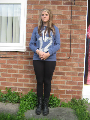
In class, we took part in an activity to capture multiple photographs of different camera angles so that we could identify each angle. Here are the photographs I took.

Low angle medium close up.
High angle long shot.
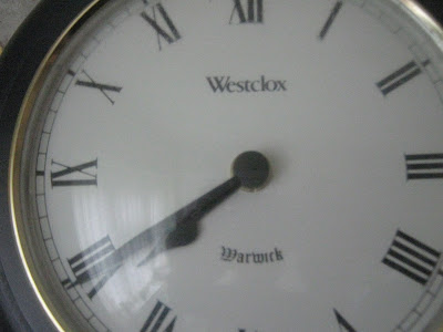
Extreme close up of the time.
Big close up of someone using a mobile phone.
Close up of someone in 'nature'.
Two shot in medium long shot.
Over the shoulder shot of someone writing.
Very long shot conveying isolation.
Medium close up.
Long shot.
Photograph which has connotations of friendship.
Photograph which has connotations of stress.
Analysing a Contents Page
In the top left hand corner, there is an image of the front cover of the magazine followed by an editor's letter which includes what is in the specific issue of the magazine, it help to give another insight into the main feature article.
'Contents' is written in a bright colour on a dark background to stand out. Underneath it, the issue date and number is displayed. This is typical to all magazines.
The images are organised in a structured grid method. The page number and a brief description of each feature is written underneath the picture to anchor the image to the feature articles.
The page is set out into 4 columns, and unlike most magazines, the list of contents are on the right hand side of the page rather than the left hand side. The contents are separated into sections like 'features', 'live reviews', 'news' and 'album reviews'. This makes it a lot easier for the reader to find what they are looking for in the magazine.
On the left hand side of the page, the photographer of the front cover image is credited. This occurs in all magazines.
Subscription details are also placing underneath the contents. They are placed here as it would be easy to see. Also, it is placed on a red background to stand out from the rest of the page which uses a red background.
Analysing a Magazine Cover
The magazine name 'Kerrang' is written in a very unique font which would not be able to be copied, therefore making it their trademark image. A white font has been used for it as it contrasts against the black background, making it much easier to read than a darker font.
A large image of a band fills the entire page to show that this is the main feature article of the issue. It is a studio photograph using direct address to pull the reader in. Another thing which does this is the buzzwords used. 'WORLD EXCLUSIVE' would make the reader want to purchase the magazine as it would be their only opportunity to read the article.
A simple colour scheme of black, white, red and blue is used. This is very effective as it doesn't make the cover look tacky and over the top. It gives a more professional, sophisticated edge to the cover.
In all of the cover lines on the page, a sans serif typeface has been used. This appears more modern and would appeal to the target audience much more than if a serif typeface was used. This is because it gives a 'no fuss' feel to the magazine.
A puff is used on the cover: free posters are included in the magazine, giving something extra to the reader.
The price of the magazine is £2.20, which is quite inexpensive for a monthly magazine. This meaning that it is much easier to sell and promote than if it was a more expensive price.
The price of the magazine is £2.20, which is quite inexpensive for a monthly magazine. This meaning that it is much easier to sell and promote than if it was a more expensive price.
Subscribe to:
Posts (Atom)


